

Joozy Recess
In today’s highly competitive food and beverage market, packaging serves as a brand’s first and most powerful communication tool with its target audience. This project focuses on creating a conceptual and contemporary beverage packaging design that visually appeals to younger consumers.
The challenge
On a crowded shelf, packaging is a brand's first and loudest conversation with its audience. The brief was to design a juice line that stands out at the point of sale and connects emotionally with younger consumers, while gently steering them toward healthier options.
Who it's for
Kids are the emotional decision-makers, parents are the actual buyers. The design had to earn a "pick me" from children and a "sure" from parents, which shaped every choice.
The approach
I explored a range of tropical fruit flavours, many of them Southeast Asian (dragonfruit, mangosteen, snakefruit, rambutan, passionfruit, durian), to give the line a distinct point of view. From there I developed an original character for each flavour, so every box carries its own personality and kids can recognise and ask for their favourite by name. Everything is held together by a consistent visual system of colour, type, and illustration style, so the flavours read as one family while staying individually memorable.
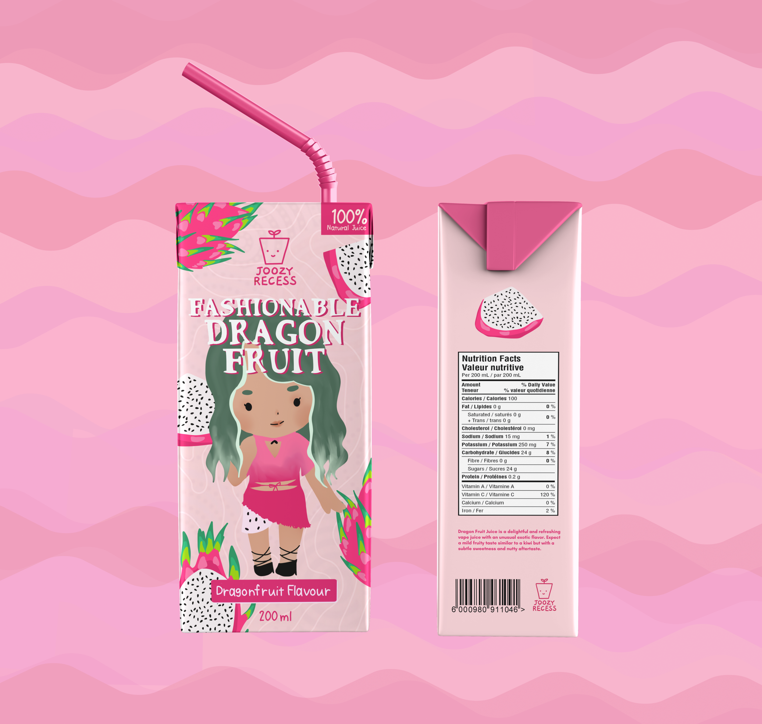
Dragonfruit Juice

Mangosteen Juice
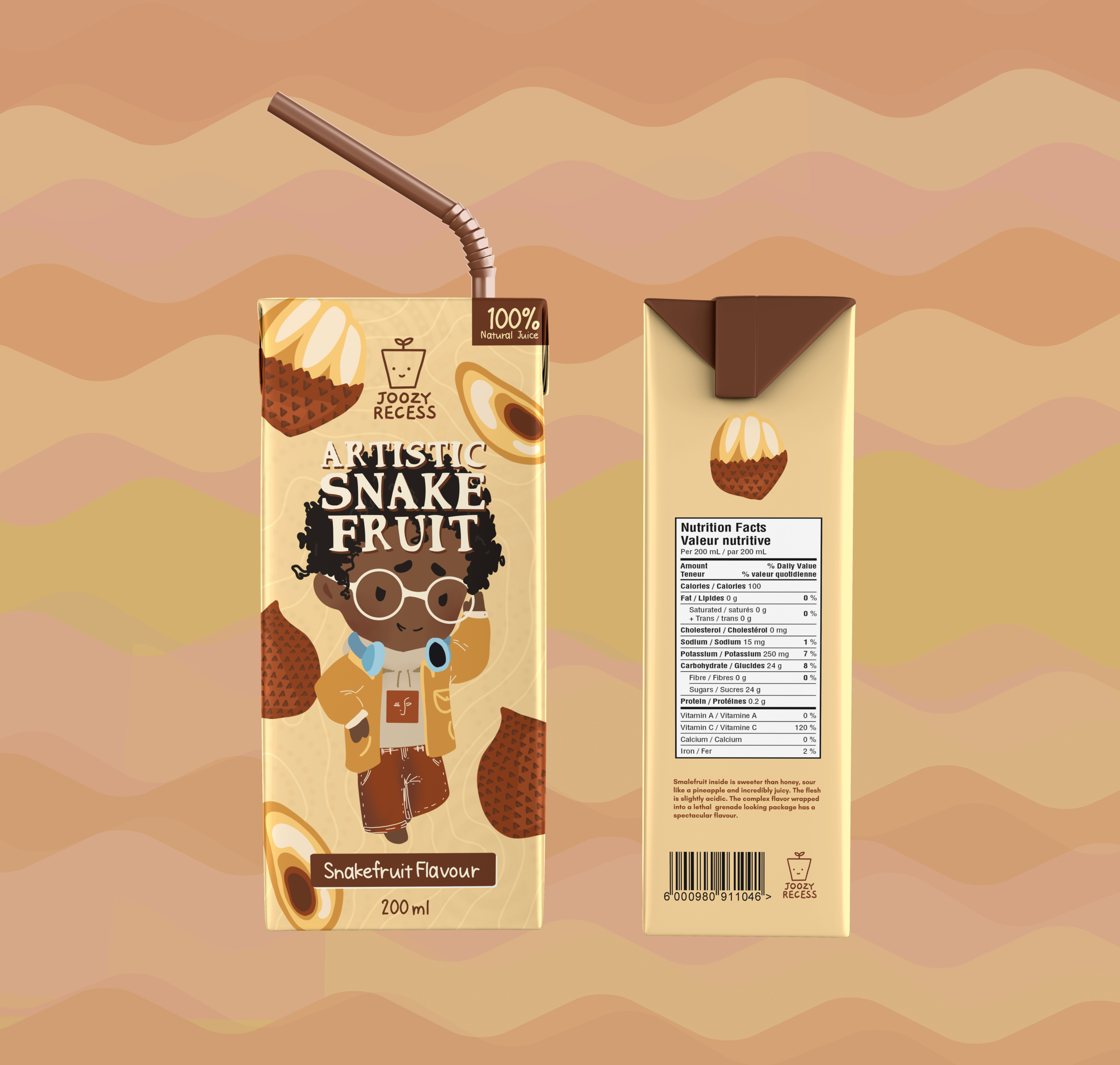
Snakefruit Juice
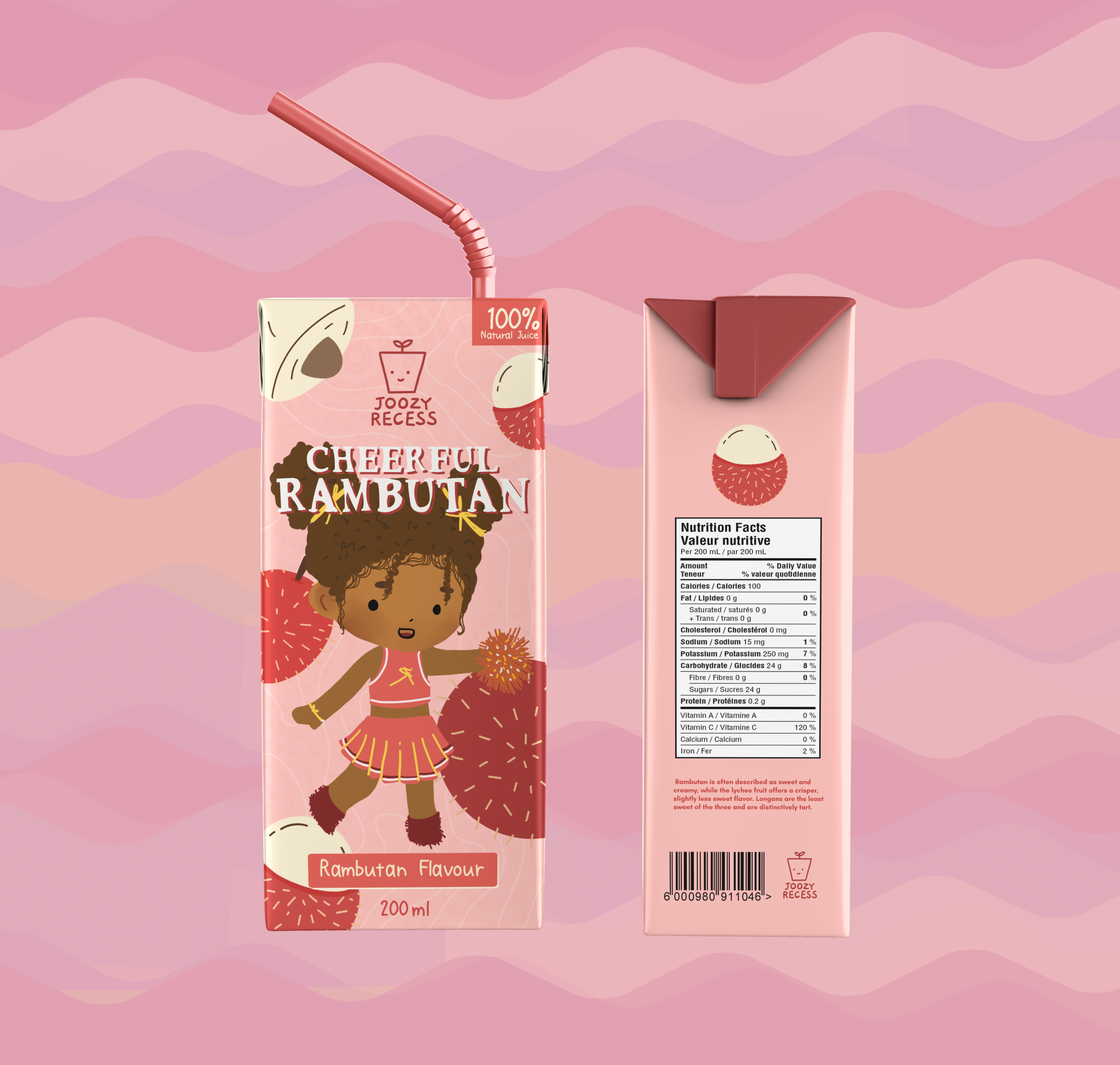
Rambutan Juice
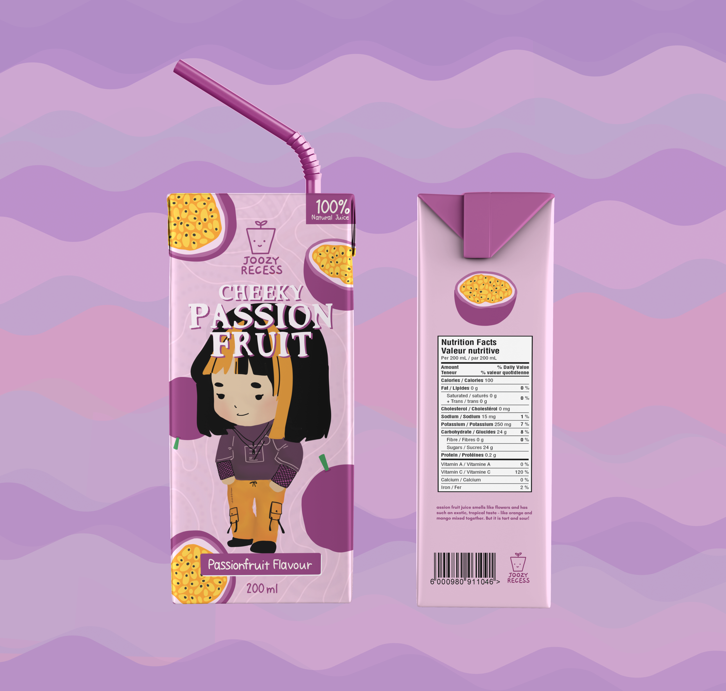
Passionfruit Juice
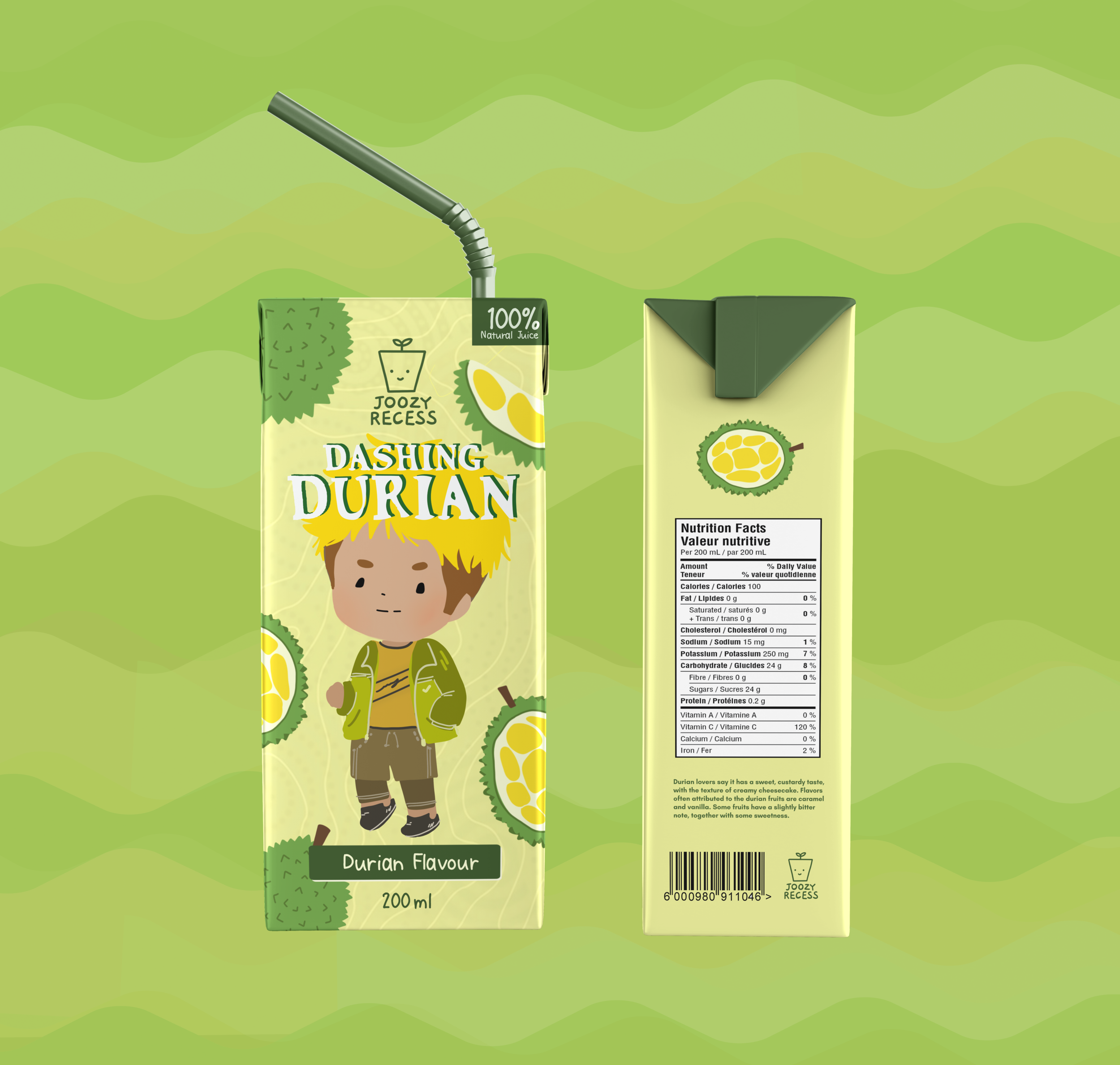
Durian Juice
The outcome
A cohesive, character-led packaging system that makes healthier choices feel fun and easy to reach for. Bright colour coding makes flavours easy to tell apart at a glance, the playful characters do the emotional work, and a clean layout keeps product info readable for the parent making the call.